 DAILYINFOGRAPHICS.EU
Military Infographics — Insignia, Camouflage & Conscription
Rank insignia, combat camouflage, battlefield hand signals, and the quiet return of conscription across Europe — four pieces, each traced back to a primary manual, statute, or filing.
Every military infographic on this site starts from the document that actually settles the question, whether that’s a 1944 army order, a field manual, or a 2026 defence-ministry statute — not from memory, a viral repost, or a source nobody names.
The oldest story is the simplest to get wrong: WW2 Allied officer rank insignia looks similar enough across five armies that charts routinely misalign a rank by one grade, and America’s own five-star rank didn’t exist until December 1944 — a detail most alignment charts skip. The most complete rebuild here is the hand-signal sheet: the “SWAT hand signals” chart shared everywhere traces to an uncredited 2016 post with no manual behind it, so this piece instead draws every one of the 40 Chapter 1 signals from the US Army’s actual TC 3-21.60, numbered against its own paragraphs.
The two current-affairs military infographics track something genuinely moving: which combat camouflage pattern each European army has issued most recently (and which eight are mid-transition to a new one), and which countries have reinstated, widened, or newly opened conscription and voluntary service programmes since 2024. Both are dated on purpose — policy in this space changes fast enough that a snapshot needs its own timestamp. That sourcing discipline is the standard behind every military infographic on this site, whether the subject is a 1944 order or a 2026 statute.
Military infographics on this site
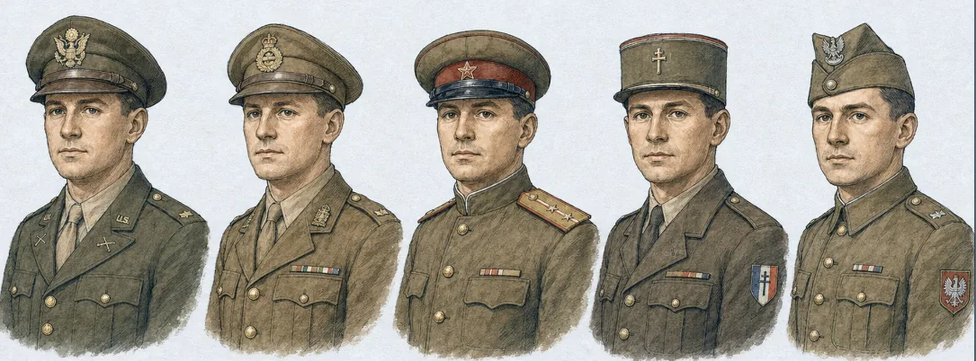
WW2 Allied Officer Rank Insignia
ww2 army ranks
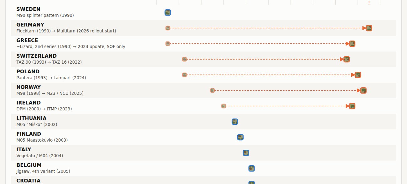
Europe's Current Combat Camouflage
30 countries · by adoption year
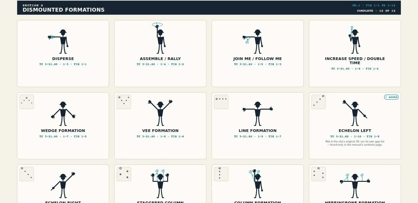
Every Hand Signal, Not Thirty
40 of 40 Chapter 1 · TC 3-21.60
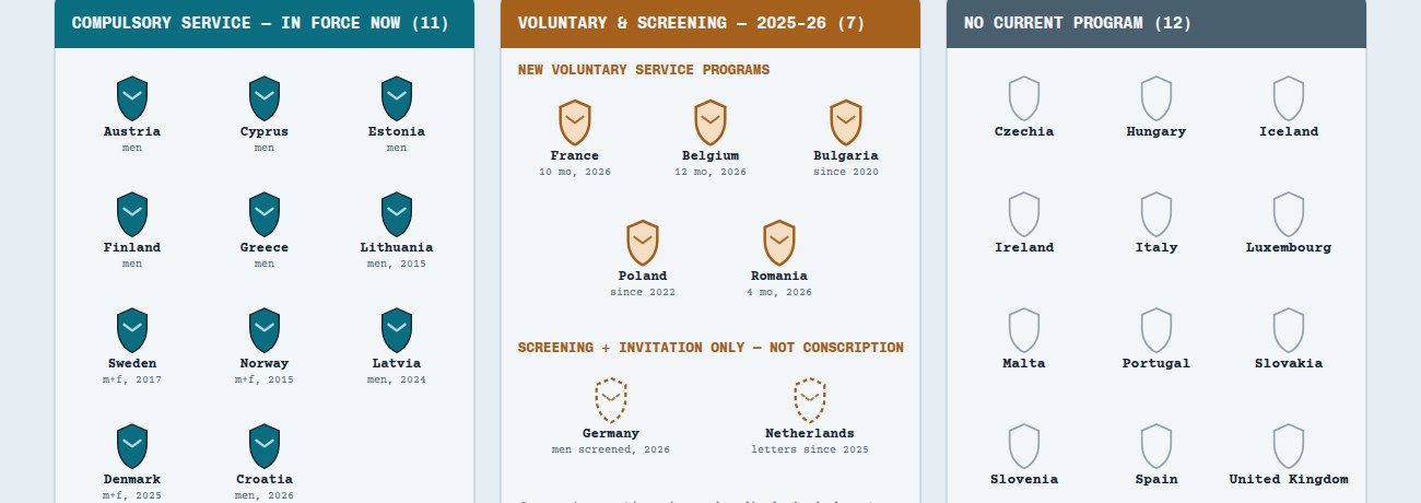
Conscription Is Quietly Coming Back to Europe
verified Aug 2026 · 30 countries
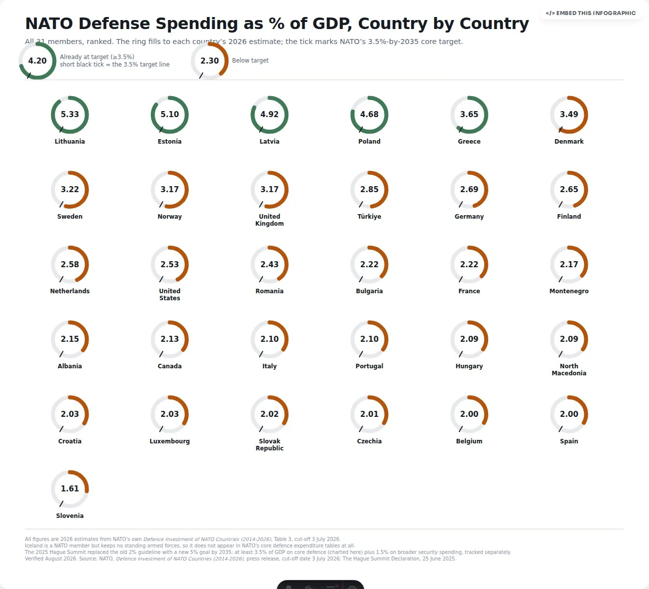
NATO Defense Spending, Country by Country
5.33% to 1.61% of GDP · 2026 NATO data
Frequently asked questions
Why does the hand-signal infographic redo a chart that's already all over the internet?
Because the widely shared "SWAT hand signals" chart traces back to an uncredited 2016 post with no actual manual behind it. This piece instead draws all 40 Chapter 1 signals directly from the US Army's TC 3-21.60, numbered against its own paragraphs.
When did the US five-star rank actually come into existence?
December 1944. Most rank-alignment charts skip that detail, which is one reason WW2 Allied officer insignia charts routinely misalign a rank by one grade across the five armies compared.
Why is the camouflage piece dated by adoption year instead of just listing current patterns?
Because which pattern is current is genuinely moving. Tracking the adoption year for each of the 30 countries covered shows not just what's issued today but which eight armies are mid-transition to a new pattern.
How many European armies are shown mid-transition to a new camouflage pattern?
Eight, according to the current combat camouflage infographic on this page, out of the 30 countries it covers.
Why is the conscription piece so heavily time-stamped as "verified Aug 2026"?
Because conscription and voluntary-service policy across Europe has been changing fast since 2024, with countries reinstating, widening, or newly opening programmes. A snapshot in this space needs its own timestamp or it goes stale quickly.
Why does a site about infographics cover military history and current military policy on the same page?
Because both share the same underlying problem: charts about either one are usually wrong in the same way, drawn from memory, a viral repost, or an unnamed source. Every piece on this page instead starts from the document that actually settles the question, whether that's a 1944 army order, a field manual, or a 2026 statute.