 DAILYINFOGRAPHICS.EU
Economy Infographics — Wages, Prices, Inflation & Energy
Wages, petrol, inflation, price levels, energy mix, and who actually owns your car brand — six pieces of European economic data, each checked against the primary statistical source rather than a repost of one.
Every economy infographic on this site shares one habit: every figure traces to Eurostat, the European Commission, or an actual company filing — not to a secondary aggregator that rounded a number somewhere upstream. That matters more in economic data than almost anywhere else on this site, because a single mis-copied decimal point turns into a permanently wrong “fact” the moment someone reposts the chart.
The cost-of-living economy infographics cover what a euro actually buys, country by country: minimum wage (Luxembourg pays 4.4× what Bulgaria does, and five EU countries have no statutory floor at all), petrol prices checked against all 27 EU states, the same shopping basket priced 36 different ways, and a decade of inflation plotted as one interactive chart you can isolate country by country.
The structural side looks at who actually holds the assets: renewable energy’s share of consumption by country, and the real ownership tree behind the car brands on European roads — drawn with the one distinction most charts skip, a minority stake is not the same thing as a parent company. That primary-source discipline is what every economy infographic on this site is held to.
Economy infographics on this site
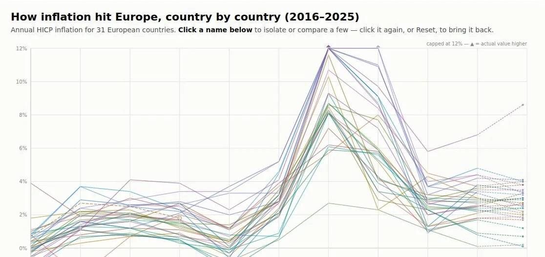
How Inflation Hit Europe
interactive · Eurostat · 31 countries
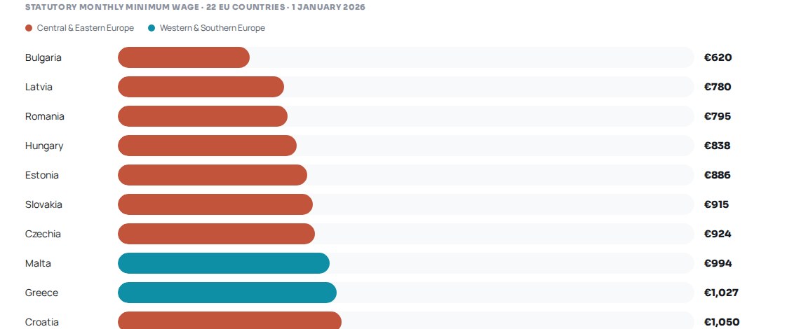
Minimum Wage Across Europe (2026)
Eurostat · 22 EU countries
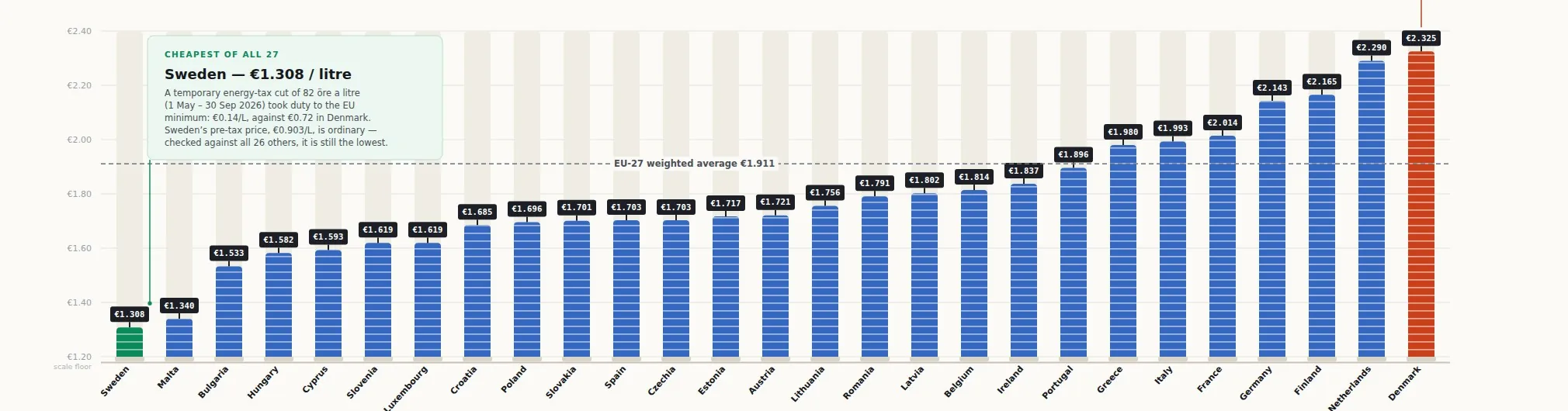
Sweden Has the EU's Cheapest Petrol
European Commission · all 27 EU states
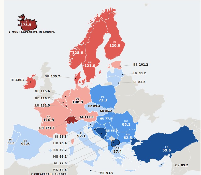
The Same Basket, 36 Different Prices
Eurostat · price levels, 2025
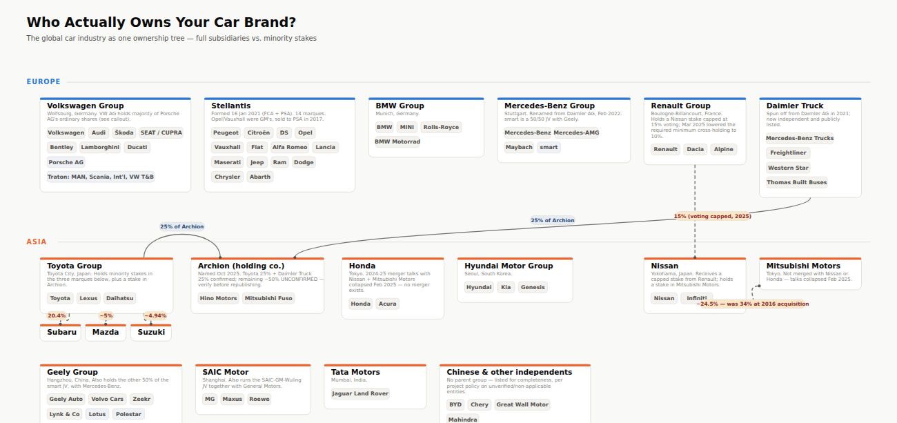
Who Owns Your Car Brand?
full ownership tree
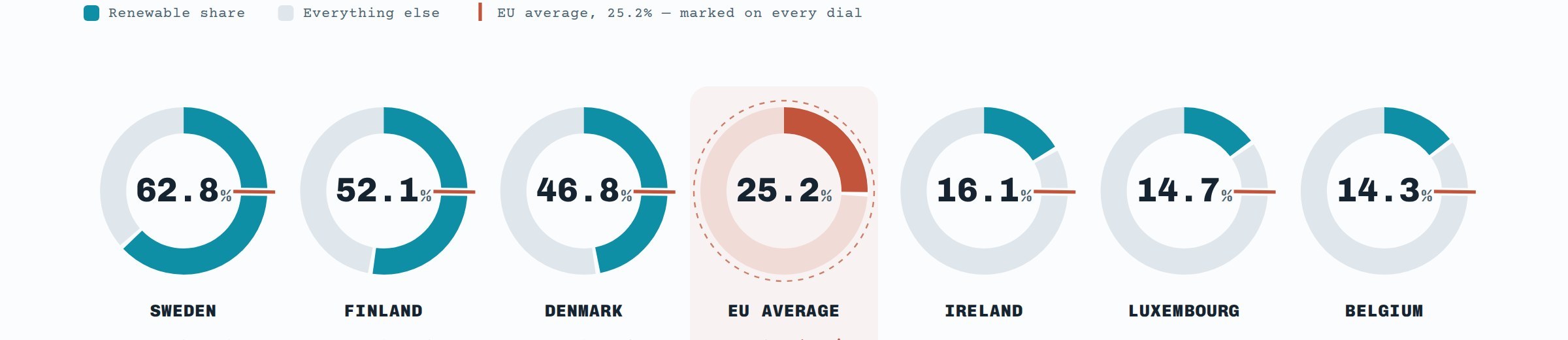
Renewable Energy by EU Country
Eurostat · 2024 data
Frequently asked questions
Why does every figure on this page trace back to Eurostat, the European Commission, or a company filing instead of a news roundup?
Because a secondary aggregator can round or mis-copy a number once, and after that the mistake gets reposted as fact. Going straight to Eurostat, the European Commission, or the actual company filing removes that middle step, which matters more in economic data than almost anywhere else on the site.
Is the minimum wage gap between Luxembourg and Bulgaria really 4.4 times?
Yes. The minimum wage piece on this page states that Luxembourg's statutory minimum wage is 4.4 times higher than Bulgaria's, drawn from Eurostat data covering 22 EU countries.
Do all EU countries have a legal minimum wage?
No. Five EU countries have no statutory minimum wage floor at all, relying instead on collective bargaining to set pay. The full country-by-country breakdown is in the minimum wage infographic itself.
Why check petrol prices against all 27 EU states rather than a handful of capitals?
Because a partial sample can flatter whichever countries get chosen. Checking the European Commission's figures for every one of the 27 EU states means the ranking, including Sweden's position as the cheapest, holds up against the full picture rather than a convenient slice of it.
What does the car-ownership piece mean by "a minority stake is not the same thing as a parent company"?
It means the ownership tree behind car brands distinguishes a company that simply holds a partial financial stake in a manufacturer from one that actually controls it as a parent. Many charts blur that line; this piece draws it explicitly.
Why is the inflation infographic interactive instead of a single static chart?
A decade of Eurostat inflation data across dozens of countries is too dense to read cleanly as one flat image. Making it interactive lets you isolate a single country's line at a time instead of squinting at every country plotted at once.